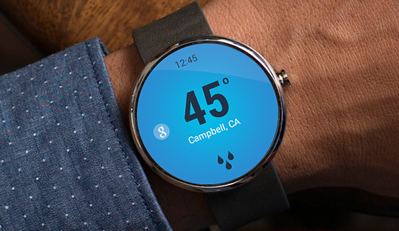
Moto 360 Interface Redesign
2015 | One Day Design Challenge | UX Design | University of Washington, Seattle
Project Summary
The project is based on the current user interface of Moto 360, a smartwatch produced by Google and Motorola. The watch was released last year and is the pioneer of Google’s Android Wear operating system. However, there are some UI design problems that impede friendlier user experience. We have picked some of them for an UI reimagination.
1. Main Screen
Different from that of the Apple Watch, Moto 360 does not have a main screen of icons for users to select different apps. Instead, users can only select them from a list, which is cumbersome to navigate.
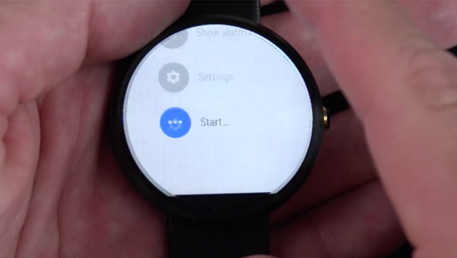
A list of operations/apps for users to select.
2. Music App
Due to the shape of the hardware, the album arts of songs will be cropped. Sometimes it is not showing the whole picture and it feels frustrating. Moreover, there is only one controlling button in the Music app — play/pause. If a user wants to skip tracks or scrub, they have to do it on the paired phone.
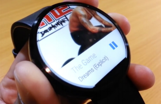
Cropped album art and the one-button control in the current Music app.
3. Heart Rate
The Health app is another target we have selected to make some changes. The current health app in Moto 360 only has a heart rate readout and a fitness timer, which makes this app more or less useless.
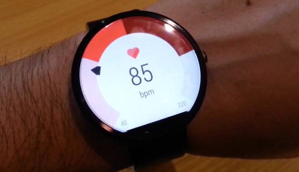
Current health app with heartbeat readout.
4. Clock Alarm UI
This is another UI that its readability is limited by the shape of the rounded hardware. The text is not fully shown unless the user scrolls the list item to the middle of the watch (the widest part).

Current alarm clock app.
Goals
Our general goal is to redesign the user interfaces for selected Moto 360 apps in order to make them utilize the shape and the screen of the hardware. Peripheral tools (paper prototypes and paper prototype container) are also implemented to better test the redesigned UI.
- Desirability: Millions of Moto 360 watches have been shipped to their customers, and those customers would find out some of the design flaws and wanted certain UI changes in order to make it easier to use.
- Feasibility: Moto 360's operating system is based on Android Wear OS, which is fully open-sourced and customizable. Design changes of UI elements will be very feasible.
- Usability: The current UI of some apps on Moto 360 received bad user feedbacks, this impedes users from further purchasing the succeeded products. They really have a lot of potential to improve.
Design Implementation
Flat UI Design
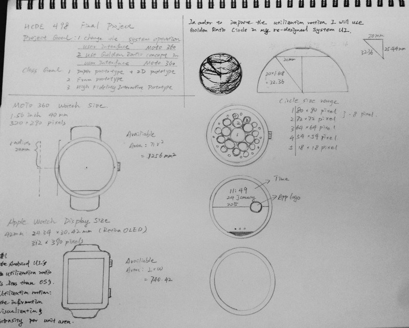
Preparation Sketch
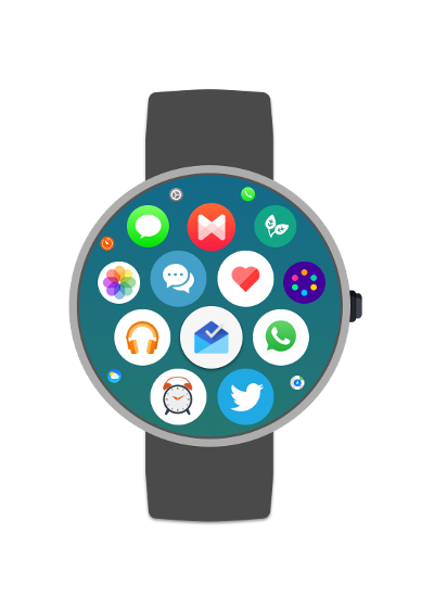
Redesigned Main Screen
We used Sketch to do the interface design and layout, and Marvel to do the interactive interface of the pictures exported from Sketch.
We compared the Moto 360 display to Apple Watch display. The size of Apple Watch is 24.34 * 30.42 = 740.42 mm^2 and Moto 360's size is 3.14 * 20^2 = 1256 mm^2. Thus the Moto 360 display area is much larger than that of the Apple Watch. However, the Moto 360 display’s utilization ratio is less than Apple Watch display’s utilization ratio which indicates that Apple Watch shows more information than Moto 360 in per pixel area. Thus, in order to improve the Moto 360's utilization ratio usage, we decided to try Apple Watch’s main user interface in Moto 360.
Music UI
As we mentioned above, the default music App does not have progress bar, the full album cover, the next/previous song button. Thus, want I want is to set the whole album cover as the music background image, the blue ring around the album art is the music progress bar and pause/play, next/previous song buttons is intuitively shown in the middle. It is easier for users to know the music information and pick the song they want to listen.

Redesigned music app, with clearer controls and album arts.
Health UI
The current health app only contains heart rate and a timer. It is not fully utilizing the sensors that the watch has. Inspired by fitness apps such as FitBit and Jawbone, we added step count and distance recording functionalities in order to make it more helpful.
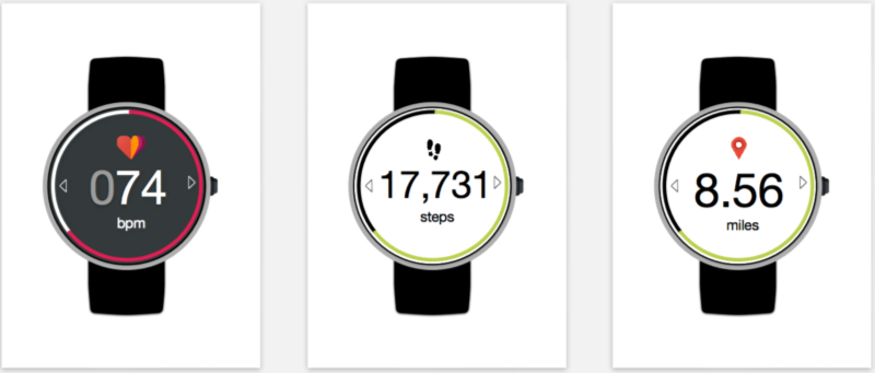
Redesigned health app, with added step count and distance travelled functionalities.
Clock Alarm UI
The alarm clock list contains lots of same information. For example, if you want to set up a time for minutes, it will show you a list of minutes: 1 minutes, 2 minutes, 3 minutes and etc. There are lots of same information “minutes” in the list so that we can set that as default and only change the time number. Thus, we redesigned the clock alarm with specific time. Users are allowed to change the digit by swiping up/down.
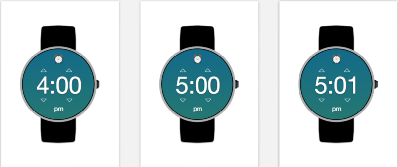
Redesigned alarm clock app, with intuitive gesture controls and display.
Physic 3D Model Design
The 3D modeling of the container for paper prototype is implemented in Rhinoceros 3D. The dimension of the Moto 360 watch was found online and the model was made to its actual scale. The model contains only the watch face and does not have bands. It is also modified to have a cutout in order to let the paper prototype slide through.
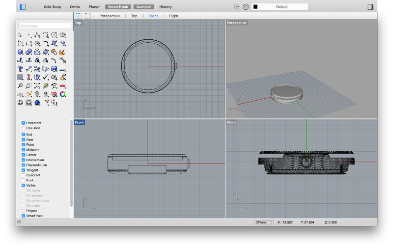
The finished 3D model file opened in Rhino.
The finished model was exported to STL format for MakerBot app to process. The model was 3D printed twice with different machines and different quality of materials.
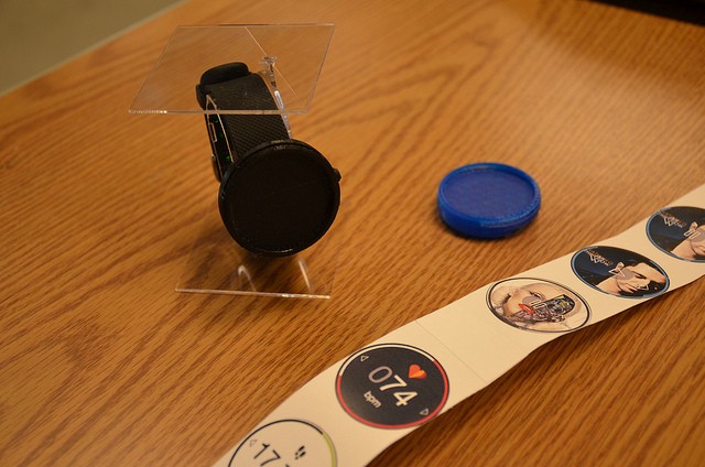
The first printed watch face (blue) and the second (black). Notice that the black “band” that the second face attached to is actually a FitBit (for aesthetic purposes). Photo credit: Lukas Eiermann
Paper Prototype
After designing the interface in Sketch, we exported all the watch faces as PNG image files. We then pasted them into Pages and rescaled them to have diameters of 40mm and exported as PDF file. After the print job, the single-page of interfaces was carefully cut and pasted together for the most precise result and the smoothest experience when sliding through the container
Evaluation
Final Deliverable
Our final deliverable contains:
- 3D printed Moto 360 watch face with paper prototyping capability
- Redesigned Moto 360 main screen
- Redesigned Moto 360 music app
- Redesigned Moto 360 health app
- Redesigned Moto 360 alarm clock app
- Paper prototype of the redesigned interfaces
- Demo video
Comments
We exhibited our product to the general public on June 4, 2015. There were a lot of visitors on our table and provided many insightful thoughts:
I really liked your printed prototyping tool, you can definitely use it in the future!
Are these UIs designed by you? Because I could not get it from the video.
How did you printed your paper prototype? Oh they are pasted together. Clever!
Your redesigned UIs really points out the flaws of the current ones!
That watch face fits the FitBit really well! I was fooled!
It’s a bummer that you cannot show your interactive prototype on the phone.
I think the interactive prototype needs more efforts. Adding some animations would significantly help!
Analysis
We have discussed the good and bad about this project, and have summarized two lists:
The good
- The project idea is very feasible, Android Wear OS is open-sourced and the redesign can be really adopted by the industry in order to provide a better user experience.
- The project is very specific, it focuses on Moto 360 and its rounded shape. We know it is a challenge to balance between the traditional watch shape and a digital one. Exploring the possiblities on a rounded interface was a real fun.
- The 3D model received very positive feedbacks from our visitors.
- The paper prototype was to the scale and the printing quality was definitely better than hand sketches.
- The user interaction and interfaced we designed really revealed what the current UI is doing wrong.
The bad (what will be improved in the future)
- Too many ideas was inspired by other products, such as Apple Watch, FitBit etc.
- More can be done to its main screen.
- The interactive interface prototype looks “cheap”, majorly because of the lack of animations.
- We did not have access to a real Moto 360, all the flaws were discovered through online videos. More could be done if we had a real device in hand.
